FAB – Floating Action Button For UX in Material Design
Floating Action Button is a forthcoming design in the material design. In a circular shape with particular actions, FAB floats on user interface. These icons float over the user interface and do actions like morphin, and launching. These icons come in two sizes (default and minis).
FAB is a lightweight, dynamic, beautiful and consistent design element which provides effective and simple navigation and improves UX. FAB being placed on the right side. This button extends its functionality and makes the program versatile. In accordance with the Google specifications, the Floating Action Button must possess an amazing tone which is offering quick access to relevant tools.
-
PSD Template
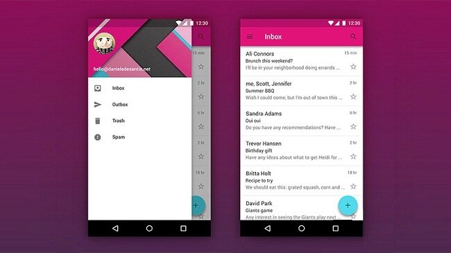 It is designed by Daniel De Santis which serves as a good example of an amazing FAB. Floating Action Button comes with a big panel which covers up the complete screen. You can easily download it and enjoy!
-
Add Media by Eric Azares
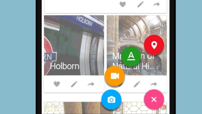 The o-shaped button is surrounded by 4 accessible Call to action which is set up in a circular shape. These 4 buttons show in brighter colors with a comparatively enormous size and logical glyph.
-
UX Exploration
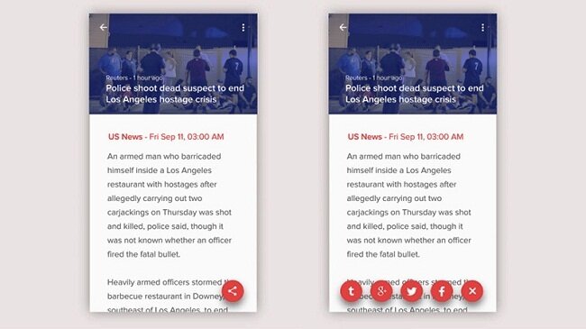 Floating Action Button indicates as a Call to Action buttons in the row. These buttons are situated in a horizontal manner.
Lois Yang has done an excellent work by selecting an amazing color palette. A red background makes the icon different among the content and get the attention of the user.
-
Magic Button
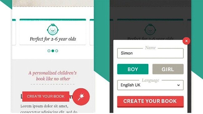 Lee Giles has launched Magic button which is totally minimalist in the manner of functionality. For creating their books, quick access is given to the people to the work panel. The design of this button is to congregate with the app and compatible to the Material stands.
-
Thumb UI
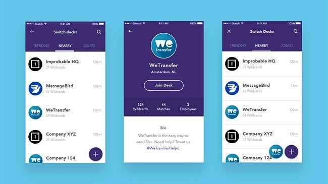 Jochem Van Der Veer has launched Thumb UI. It is placed on the right side with a simple looking and eye-catching design which is a functional. Sometimes Thumb UI design placed with the mini version of the app logo.
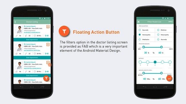 MayurKarodia has designed Alternacare. It enables the individual to sort out the complicated information as well as it helps to get targeted within minutes. The vivid color theme and audacious look of the FAB makes it different from other content while getting user attention.
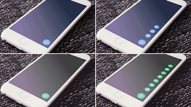 Shu Makino has designed Liquid FAB. It includes 7 items that become visible one after another.
-
Score Android
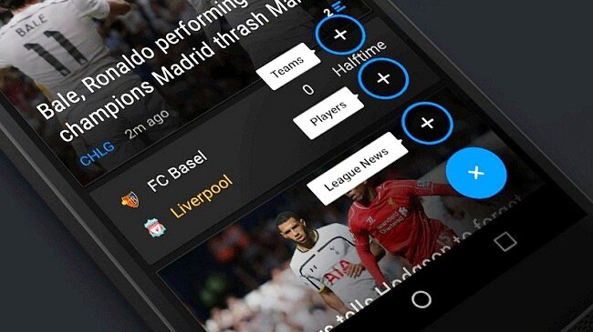 Score Android is designed by Matt Legaspi. It is a sophisticated, refined and well-designed with Call to Action. It is combined with amazing double tone color theme. It gets great aesthetics while converting actions into benefits.
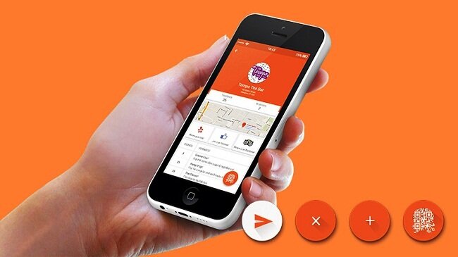 The Swipii App Concept is designed by Sarah Ahmad. It makes the accessibility easier and functions so well. Also, it shows a pop-up page with a Quick Response code which assists gathering points in a short span of time.
Conclusion
FAB contributes to User Experience as well as making User Interface efficient and attractive. It makes the app more productive.

